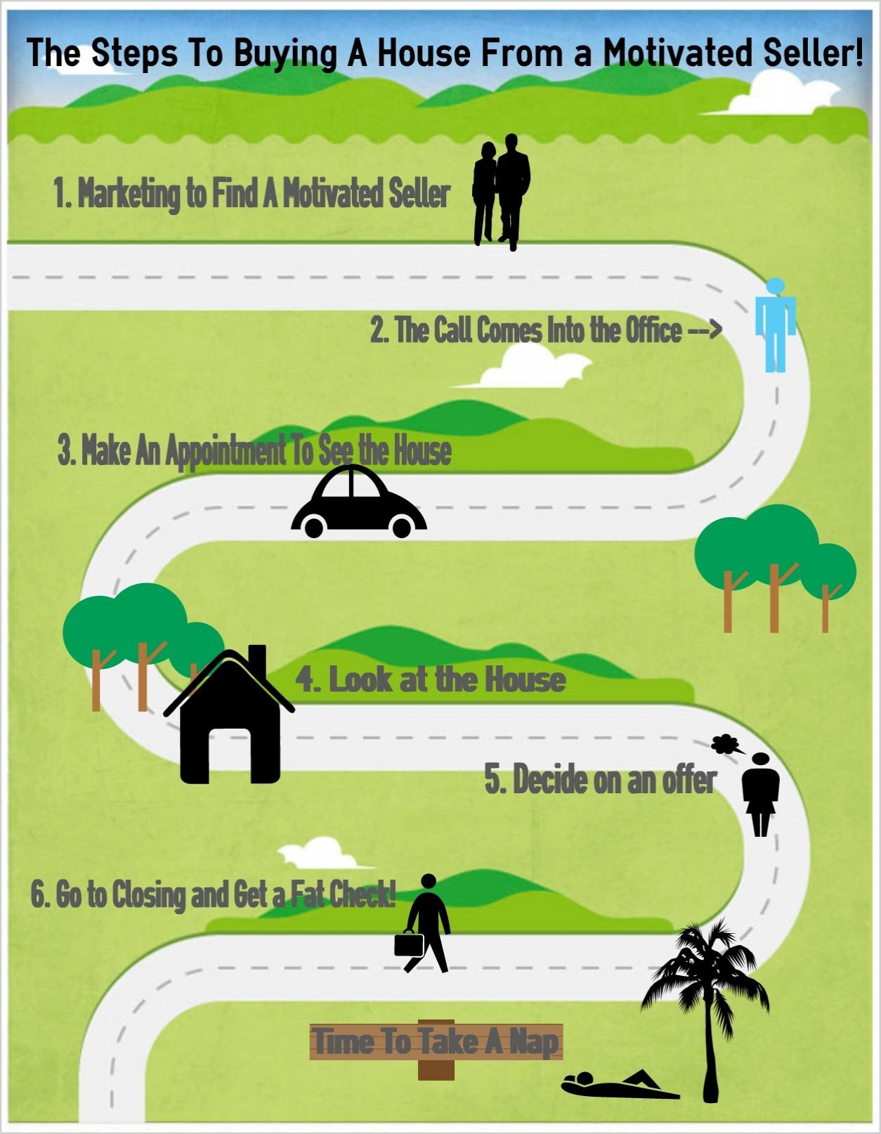
I have wanted to know for some time how folks create those great looking infographics that you see on websites and in EBooks. I love it when I pull up a blog post that has included an infographic that helps explain the topic they are writing about.
But to tell you the truth, I hadn’t even looked into it because it seemed like it would be a pretty difficult process. Recently I decided to take the plunge and figure it out.
What I found is that just like almost everything else, there are tools available (many of them free) to create these graphics and charts. These visual aids will make your blog post or EBook look like a million bucks, and they will make you look really awesome in the process.
For me to use these tools they have to be easy. I don’t have a lot of time (or patience) to spend “playing” with them to figure out the process. So when I found some resources that even I can use pretty easily, that was pretty exciting.
Where Do I Begin?
I did some research, and I have some sites here for you to check out:
I loved this site because they had a video to show just how easy it is to create your own Infographics using their drag and drop format. You can choose from previously created themes or “vhemes” which are visual themes that you can easily customize. This web based app allows you to change and customize any part of the “vheme”. All you do is drag, edit and share. Even a non techie like me can do this. And the cost; FREE! You can check out the quick Infographic I created at the bottom of the page using one of their templates. I didn’t spend much time on this, so it is pretty simple.
Check out this quick video to see for yourself just how easy it is to use Easel.ly.
The second site you can take a look at is Infogr.am. There are a number of chart types and it is free too. I went ahead and created a free account to check it out, but I didn’t find it quite as easy to navigate as Easel.ly.
Pictochart has a really nice selection of over 90 themes you can use. They currently have several hundred thousand users, and seem to be one of the bigger players in this market. They offer a free trial, but after that the cost is $29 a month. This is a great site for those folks that need to make Infographics on a regular basis, but for most of us that just want an occasional chart or Infographic there is probably no need to pay for this service. It is never the less an awesome site.
There is one more I wanted to point out that is just for resume’s called Visualize me. You can quickly create an online resume format that looks really nice with just a few clicks. It will also help you to optimize your LinkedIn Profile when you post this Visual Resume.
Take the Plunge; Go Make an Infographic
It’s pretty easy to get started with any one of these services. All you do is register and start creating. Send me your “creation” when you’re done so I can take a look.
Here’s one that I made in just a few minutes.
If you haven’t already subscribed, be sure to do that today so you don’t miss any of the business building tips I have coming your way. I want 2013 to be your best year ever! And if you enjoyed this article, please share it.


Hey Brian –
The site is drop dead easy to use even for a “non techie” like me. I made that one in 5-10 minutes just “playing around”. I’m going to really like using the site. Thanks for stopping by.
Sharon
Wow! I am checking this out now!
The steps to learning real estate investing!
Thanks so much Sharon!
Brian
Los Angeles
Terry –
I figured it was really complicated, but it is surprisingly easy since templates are provided. Give it a try. It’s a great way to make your articles and ebooks more interesting and to explain more complex ideas. I love it when I find these kinds of tooks that are actually simple to use. Thanks for your comments as always.
Sharon
Great post! I have been wanting to learn more about creating infographics.
Hey Seth – I was thrilled to find these tools. I always thought these types of graphics and charts would be really hard to do. Much to my surprise, these sites are really simple to use. I haven’t forgotten about the podcast. I have been really tied up with other things, but it is on the horizon. Thanks for stopping by.
Sharon
Awesome! I am totally checking this out. These kinds of info graphics can help readers understand things SO much easier (I know they certainly help me). Thanks for the heads up on this Sharon!
Nicole – I was just playing around. It’s actually pretty easy to use though. You should give it a try.
Sharon
Well Done.